Notebook Therapy Rebrand
Notebook Therapy is a purely online stationery store that is on a mission to make East Asian inspired stationary more accessible to those who love it. They have a variety of products such as pens, notebooks, and tote bags that cater to a younger female audience. Although their products reflect the target audience they are approaching, their logo does not.
Challenge
Make their branding reflect the type of products that they sold. Their products are bright and colorful, but their logo is very dark and dull. Their branding does not stand out compared to other competitors.
Solution
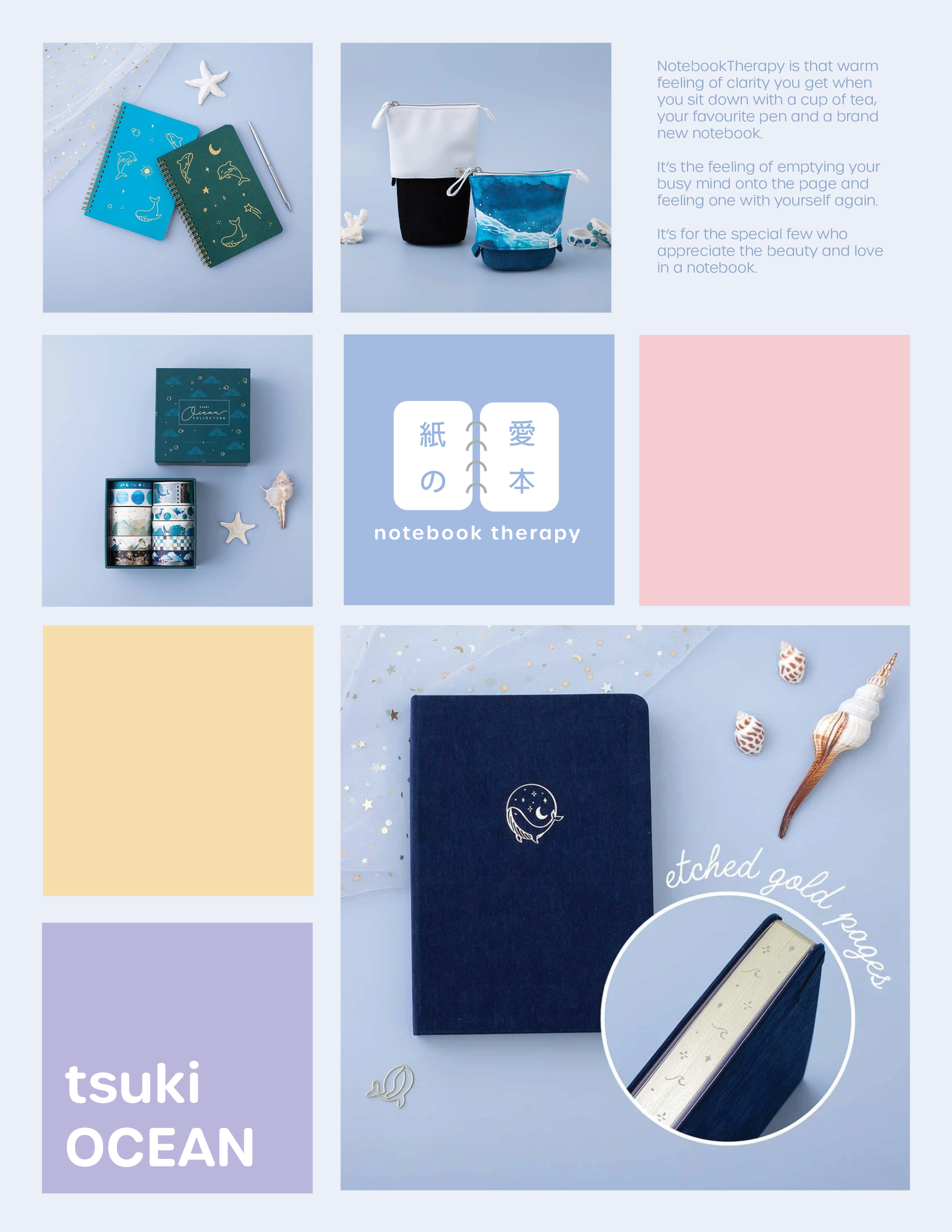
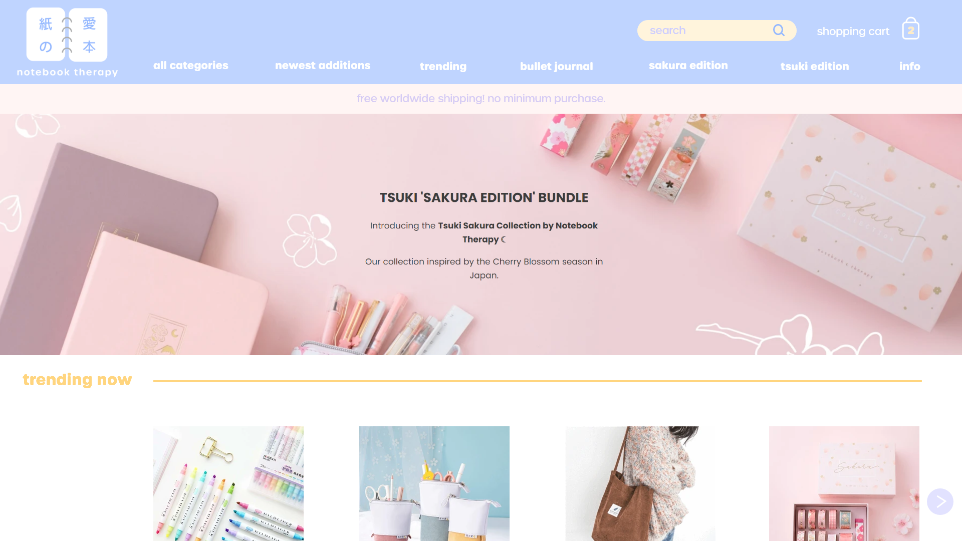
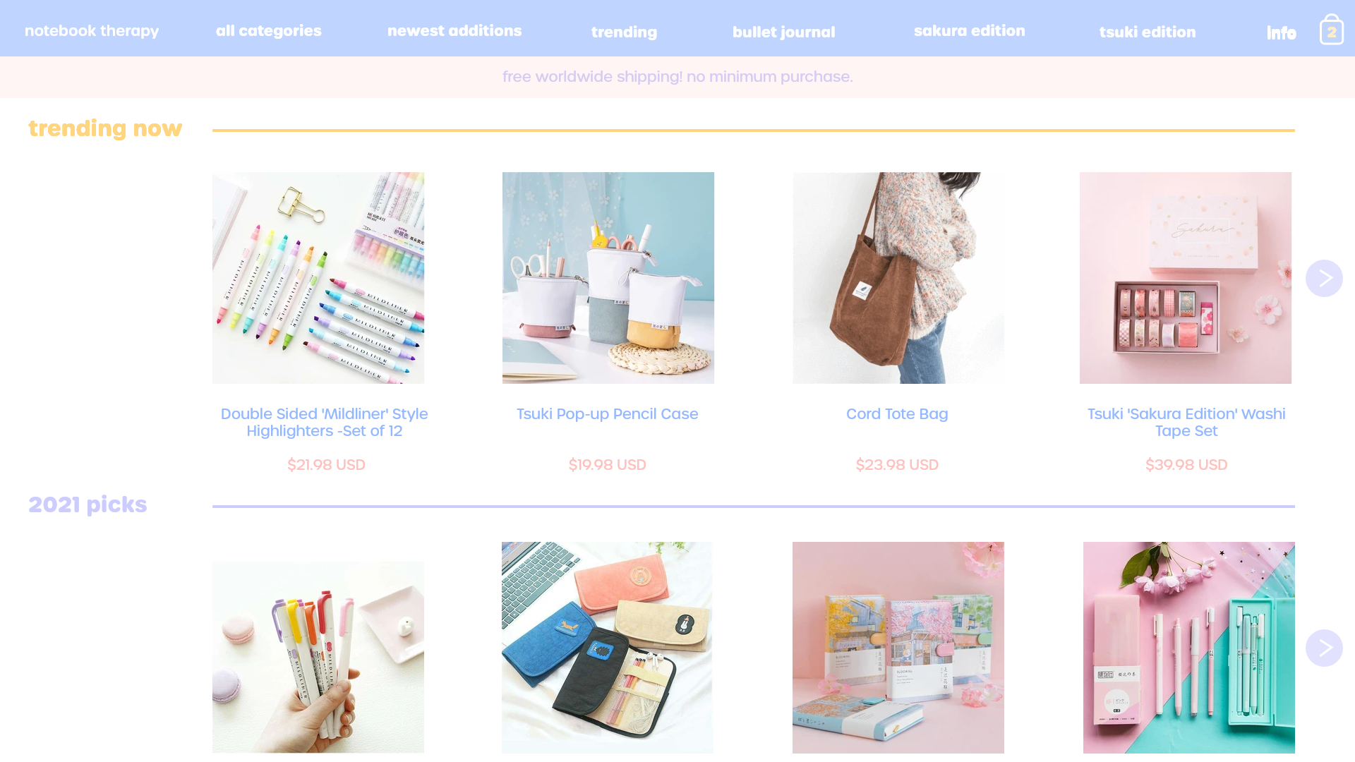
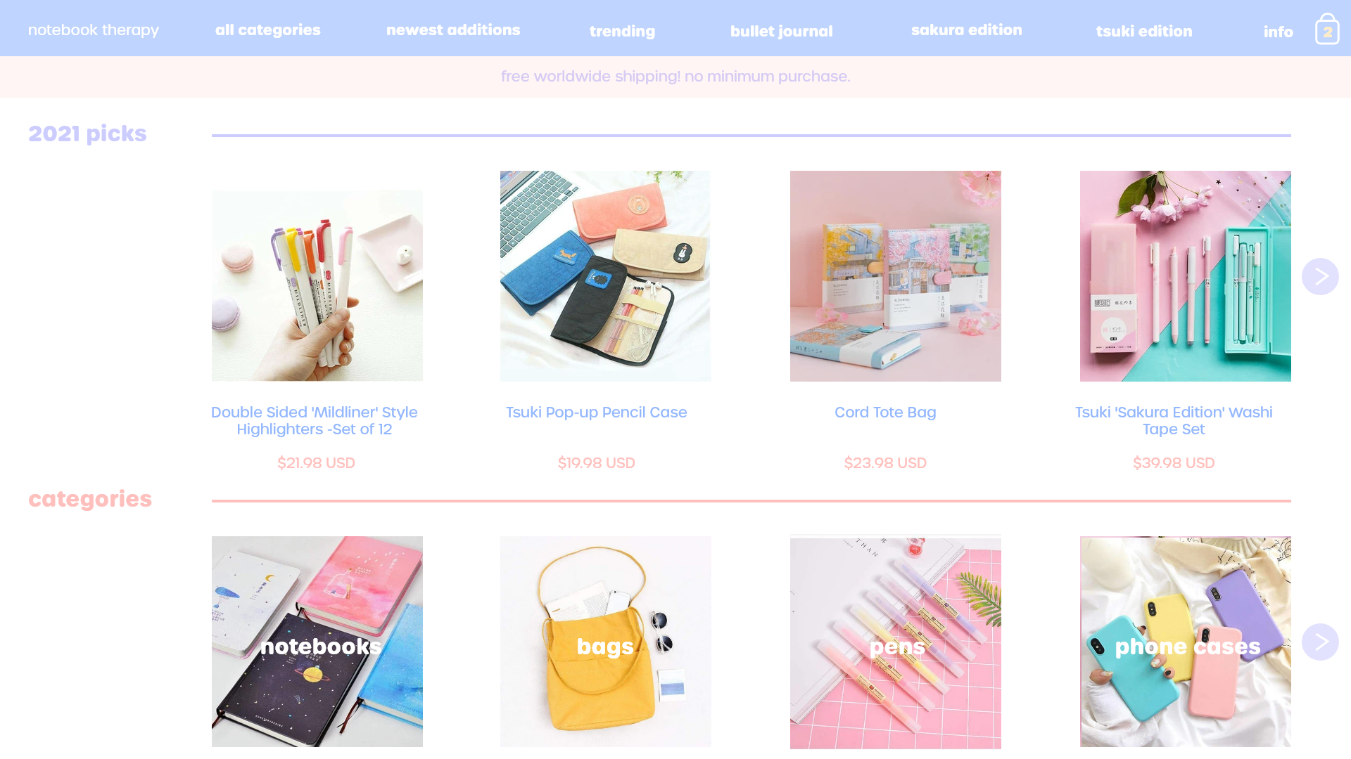
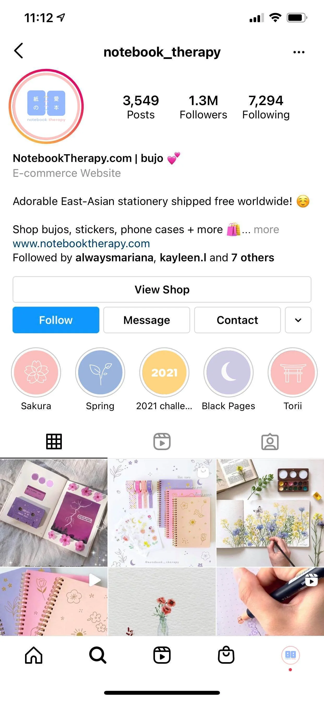
Creating a logo that reflects the type of products Notebook Therapy is selling using bright and fun colors. A color palette was created so the brand stands out more in social media and adds to recognizability. The website was redesigned utilizing the color palette to create a less stale environment that a younger audience would enjoy.
Scope
Branding
Digital
Media
Print
UI/UX

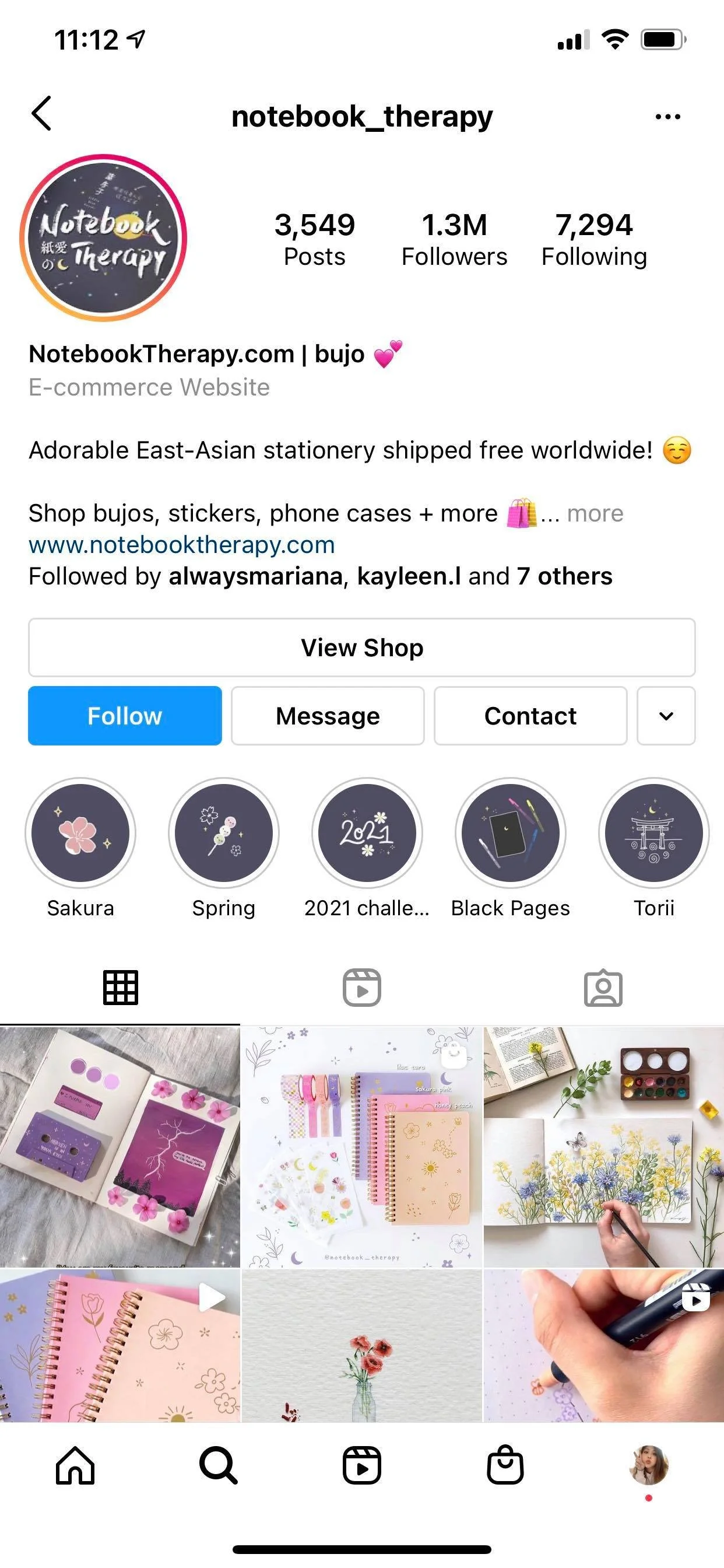
The old logo is very dark and has a more historical look because of the calligraphic font. This logo fits more of a sophisticated audience and does not reflect the aesthetic of their products.

A symbol of a notebook and pre-existing Japanese symbols were utilized to make the new logo. The color palette is blue, pink, yellow, and purple to mimic the bright nature of the store and the products. The rounded font also fits the youthful theme.